css小幽灵系列加载动画
前言
此教程用的是修改源码的方式,会替换掉原始的加载动画。如果想要有好几个加载动画,随时可切换的话,可以参考 Akilar店长 下面这篇教程。

更新日志
更新日志
2022.05.14
新增SVG小幽灵加载动画
2022.05.12
新增爱心小幽灵加载动画、发光小幽灵加载动画
2022.05.10
新增带小星星的小幽灵加载动画
教程
带星星小幽灵
带星星小幽灵加载动画预览

修改
[Blogroot]\themes\butterfly\layout\includes\loading\loading.pug,复制以下代码替换源文件。1
2
3
4
5
6
7
8
9
10
11
12
13
14
15
16
17
18
19
20
21
22
23
24
25
26
27
28
29
30
31
32
33
34
35
36
37
38#loading-box
.ghost-container
.ghost
.body
.ghost-head
.face
.eyes-row
.eye.left
.eye.right
.mouth-row
.left.rosy
.smile
.mouth-top
.mouth-bottom
.right.rosy
.ghost-body
.arm.left
.arm.right
.ghost-skirt
.down.pleat
.pleat.up
.down.pleat
.pleat.up
.down.pleat
.shadow
.stars
.orange.pointy.star.star-1
.star-element
.orange.pointy.star.star-2
.star-element
.pointy.star.star-3.yellow
.star-element
.pointy.star.star-4.yellow
.star-element
.blue.round.star.star-5
.star-element
.blue.round.star.star-6
.star-element修改
[Blogroot]\themes\butterfly\source\css\_layout\loading.styl,复制以下代码替换源文件。1
2
3
4
5
6
7
8
9
10
11
12
13
14
15
16
17
18
19
20
21
22
23
24
25
26
27
28
29
30
31
32
33
34
35
36
37
38
39
40
41
42
43
44
45
46
47
48
49
50
51
52
53
54
55
56
57
58
59
60
61
62
63
64
65
66
67
68
69
70
71
72
73
74
75
76
77
78
79
80
81
82
83
84
85
86
87
88
89
90
91
92
93
94
95
96
97
98
99
100
101
102
103
104
105
106
107
108
109
110
111
112
113
114
115
116
117
118
119
120
121
122
123
124
125
126
127
128
129
130
131
132
133
134
135
136
137
138
139
140
141
142
143
144
145
146
147
148
149
150
151
152
153
154
155
156
157
158
159
160
161
162
163
164
165
166
167
168
169
170
171
172
173
174
175
176
177
178
179
180
181
182
183
184
185
186
187
188
189
190
191
192
193
194
195
196
197
198
199
200
201
202
203
204
205
206
207
208
209
210
211
212
213
214
215
216
217
218
219
220
221
222
223
224
225
226
227
228
229
230
231
232
233
234
235
236
237
238
239
240
241
242
243
244
245
246
247
248
249
250
251
252
253
254
255
256
257
258
259
260
261
262
263
264
265
266
267
268
269
270
271
272
273
274
275
276
277
278
279
280
281
282
283
284
285
286
287
288
289
290
291
292
293
294
295
296
297
298
299
300
301
302
303
304
305
306
307
308
309
310
311
312
313
314
315
316
317
318
319
320
321
322
323
324
325
326
327
328
329
330
331
332
333
334
335
336
337
338
339
340
341
342
343
344
345
346
347
348
349
350
351
352
353
354
355
356
357
358
359
360
361
362
363
364
365
366
367
368
369
370
371
372
373
374
375
376
377
378
379
380
381
382
383
384
385
386
387
388
389
390
391
392
393
394#loading-box
position fixed
z-index 10000
width 100vw
display flex
justify-content center
align-items center
height 100vh
background #292b25
overflow hidden
text-align center
&.loaded
z-index -1000
.ghost-container
display none
@keyframes twinkle {
0% {
transform: rotate(0deg) scale(1, 1);
}
25% {
transform: rotate(10deg) scale(0.8, 0.8);
}
50% {
transform: rotate(0deg) scale(0.9, 0.9);
}
75% {
transform: rotate(-20deg) scale(0.6, 0.6);
}
100% {
transform: rotate(0deg) scale(1, 1);
}
}
@keyframes waving {
0% {
transform: rotate(-45deg);
}
25% {
transform: rotate(-55deg);
}
50% {
transform: rotate(-45deg);
}
75% {
transform: rotate(-55deg);
}
100% {
transform: rotate(-45deg);
}
}
.ghost-container
position relative
height 140px
z-index 1000
padding 20px 30px 0 30px
perspective 30px
.ghost
position relative
width 80px
z-index 1001
height 115px
.body
position relative
height 115px
animation float 2s ease infinite
.face
position absolute
bottom 10px
left 10px
width 50px
height 30px
z-index 1
.eye
height 10px
width 10px
background-color #271917
border-radius 100%
position absolute
bottom 0
transition height 50ms ease
&.left
left 5px
&.right
right 5px
.smile
position absolute
left 50%
top 0
height 10px
transform translate3d(-50%, 0, 0)
.rosy
position absolute
top 0
width 12px
height 4px
background-color #f5c1b6
border-radius 100%
&.left
left 0px
&.right
right 0px
.arm
height 36px
width 22px
background #f0efdc
border-radius 100%/90%
position absolute
&.left
left -12px
top 10px
transform rotateZ(-45deg)
left 0
top 5px
transform-origin bottom center
&.right
right -12px
top 10px
transform rotateZ(45deg)
.ghost-head
position relative
width 80px
height 0
padding-top 100%
border-radius 100%
background-color #f0efdc
.ghost-body
position absolute
top 40px
height 0
width 80px
padding-top 85%
background-color #f0efdc
.shadow
position absolute
bottom -40px
left 50%
width 120px
height 12px
filter blur(3px)
border-radius 100%
background-color #191d18
animation shadow 2s ease infinite
.eyes-row,
.mouth-row
position relative
height 10px
.mouth-row
margin-top 3px
.smile
.mouth-top
width 18px
height 2px
border-radius 2px 2px 0 0
background-color #271917
.mouth-bottom
position absolute
width 18px
height 8px
bottom 0
overflow hidden
transition height 150ms ease
&:after
content ''
display block
position absolute
left 0
bottom 0
width 18px
height 16px
border-radius 100%
background-color #271917
.ghost-skirt
position absolute
left 0
bottom 0
width 100%
display flex
transform translateY(50%)
.pleat
width 20%
height 8px
border-radius 100%
&.down
background-color #f0efdc
&.up
background #292b25
position relative
top 1px
@keyframes float {
0%,
100% {
top: 10px;
}
40% {
top: 0px;
}
}
@keyframes arms-left {
0%, 100% {
transform: translate(-50%, -50%) rotate(50deg);
}
40% {
transform: translate(-50%, -50%) rotate(40deg);
}
}
@keyframes arms-right {
0%, 100% {
transform: translate(-50%, -50%) rotate(-50deg);
}
40% {
transform: translate(-50%, -50%) rotate(-40deg);
}
}
@keyframes shadow {
0%, 100% {
transform: translateX(-50%) scale(1);
}
40% {
transform: translateX(-50%) scale(0.8);
}
}
.star
top -10px
position absolute
animation twinkle 2s infinite linear
transition top 400ms ease-out, left 400ms ease-out
.star
.star-element
height 9px
width 9px
border-radius 100%
&.pointy
transform rotate(-15deg)
.star-element
height 6px
width 6px
&:before
height 6px
width 12px
left -3px
top 0
transform skewX(60deg)
&:after
height 12px
width 6px
right 0
bottom -3px
transform skewY(-60deg)
.star
&.pointy
.star-element
&:before
content ''
display block
position absolute
background green
border-radius 6px
.star
&.pointy
.star-element
&:after
content ''
display block
position absolute
background green
border-radius 6px
.star.orange .star-element,
.star.orange .star-element:before,
.star.orange .star-element:after
background-color #df814d
.star.yellow .star-element,
.star.yellow .star-element:before,
.star.yellow .star-element:after
background-color #ffd186
.star.blue .star-element,
.star.blue .star-element:before,
.star.blue .star-element:after
background-color #83d0bc
.star-1
top: 75%;
left: 6%;
.star-2
top: 35%;
left: 88%;
transition-delay 250ms
animation-delay 200ms
.star-3
top: 8%;
left: 20%;
transition-delay 300ms
animation-delay 400ms
z-index 2
.star-4
top: 70%;
left: 92%;
transition-delay 350ms
animation-delay 600ms
.star-5
top: 35%;
left: 4%;
transition-delay 400ms
animation-delay 800ms
z-index 2
.star-6
top: 2%;
left: 70%;
transition-delay 450ms
animation-delay 1000ms
.move-stars-out
.star-element
animation star-entrance 1500ms
.stars-out
.star
transition top 1500ms ease-out, left 1500ms ease-out
.star-1
top 75%
left 6%
transition-delay 0ms, 0ms
.star-element
animation-delay 0ms
.star-2
top 35%
left 88%
transition-delay 200ms, 200ms
.star-element
animation-delay 200ms
.star-3
top 8%
left 20%
transition-delay 400ms, 400ms
.star-element
animation-delay 400ms
.star-4
top 70%
left 92%
transition-delay 600ms, 600ms
.star-element
animation-delay 600ms
.star-5
top 35%
left 4%
transition-delay 800ms, 800ms
.star-element
animation-delay 800ms
.star-6
top 2%
left 70%
transition-delay 1000ms, 1000ms
.star-element
animation-delay 1000ms
.move-stars-in
.star-element
animation star-exit 400ms linear
.star-1
.star-element
animation-delay 100ms
.star-2
.star-element
animation-delay 150ms
.star-3
.star-element
animation-delay 200ms
.star-4
.star-element
animation-delay 250ms
.star-5
.star-element
animation-delay 300ms
.star-6
.star-element
animation-delay 350ms
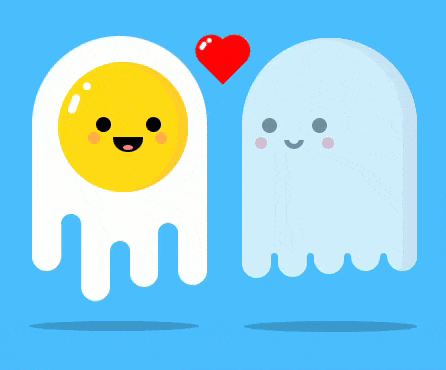
爱心小幽灵
爱心小幽灵加载动画预览
- 修改
[Blogroot]\themes\butterfly\layout\includes\loading\loading.pug,复制以下代码替换源文件。1
2
3
4
5
6
7
8
9
10
11
12
13
14
15
16
17
18
19
20
21
22
23
24
25
26
27#loading-box
.loading-container
.egg
- var legs = 0;
ul.egg-ul
while legs < 7
- legs++;
li.egg-list
.face
.eyes
.smile
.cheeks
.shine
#egg-shadow.egg-shadow
.loading-heart
.loading-light
.ghost
- var legs = 0;
ul.ghost-ul
while legs < 9
- legs++;
li.ghost-list
.face
.eyes
.smile
.cheeks
#ghost-shadow.ghost-shadow - 修改
[Blogroot]\themes\butterfly\source\css\_layout\loading.styl,复制以下代码替换源文件。1
2
3
4
5
6
7
8
9
10
11
12
13
14
15
16
17
18
19
20
21
22
23
24
25
26
27
28
29
30
31
32
33
34
35
36
37
38
39
40
41
42
43
44
45
46
47
48
49
50
51
52
53
54
55
56
57
58
59
60
61
62
63
64
65
66
67
68
69
70
71
72
73
74
75
76
77
78
79
80
81
82
83
84
85
86
87
88
89
90
91
92
93
94
95
96
97
98
99
100
101
102
103
104
105
106
107
108
109
110
111
112
113
114
115
116
117
118
119
120
121
122
123
124
125
126
127
128
129
130
131
132
133
134
135
136
137
138
139
140
141
142
143
144
145
146
147
148
149
150
151
152
153
154
155
156
157
158
159
160
161
162
163
164
165
166
167
168
169
170
171
172
173
174
175
176
177
178
179
180
181
182
183
184
185
186
187
188
189
190
191
192
193
194
195
196
197
198
199
200
201
202
203
204
205
206
207
208
209
210
211
212
213
214
215
216
217
218
219
220
221
222
223
224
225
226
227
228
229
230
231
232
233
234
235
236
237
238
239
240
241
242
243
244
245
246
247
248
249
250
251
252
253
254
255
256
257
258
259
260
261
262
263
264
265
266
267
268
269
270
271
272
273
274
275
276
277
278
279
280
281
282
283
284
285
286
287
288
289
290
291
292
293
294
295
296
297
298
299
300
301
302
303
304
305
306
307
308
309
310
311
312
313
314
315
316
317
318
319
320
321
322
323
324
325
326
327
328
329
330
331
332
333
334
335
336
337
338
339
340
341
342
343
344
345
346
347
348
349
350
351
352
353
354
355
356
357
358
359
360
361
362
363
364
365
366
367
368
369
370
371
372
373
374
375
376
377
378
379
380
381
382
383
384
385
386
387
388
389
390
391
392
393
394
395
396
397
398
399
400
401
402
403
404
405
406
407
408
409
410
411
412
413
414
415
416
417
418
419
420
421
422
423
424
425
426
427
428
429
430
431
432
433
434
435
436
437
438
439
440
441
442
443
444
445
446
447
448
449
450
451
452
453
454
455
456
457
458
459
460
461
462
463
464
465
466
467
468
469
470
471
472
473
474
475
476
477
478
479
480
481
482
483
484
485
486
487
488
489
490
491
492
493
494
495
496
497
498
499
500
501
502
503
504
505
506
507
508
509#loading-box
position fixed
z-index 100005
width 100vw
height 100vh
background #48befe
overflow hidden
&.loaded
z-index -1000
.loading-container
display none
.loading-container
position absolute
white-space nowrap
left 50%
top 50%
transform translate(-50%, -50%)
.ghost-ul
margin 0
padding 0
.ghost-list
list-style none
.egg-ul
margin 0
padding 0
.egg-list
list-style none
.egg
width 87.5px
height 110px
border-radius 100px 100px 0px 0px
background #fdfeff
position relative
display inline-block
animation floating 2.5s ease-out infinite
left -5%
.face
width 65px
height 65px
background #ffdb10
position absolute
margin 15% 15%
border-radius 100%
box-shadow inset -10px 1px 0 #ffcc24
.eyes
width 7.5px
height 7.5px
background #000
border-radius 100%
position relative
top 27.5px
left 19px
animation blink 3s infinite 2s
&::after
content ""
width 7.5px
height 7.5px
position absolute
background #000
border-radius 100%
left 25px
.smile
position relative
border-bottom-left-radius 90px
border-bottom-right-radius 90px
width 15px
height 7.5px
background #000
left 27.5px
top 30px
&::after
content ""
position absolute
width 5px
height 2.5px
background #ff7e7e
border-radius 100%
left 5px
top 4px
.cheeks
position relative
width 6px
height 6px
background #ff7e7e
border-radius 100%
opacity 0.5
top 20px
left 15px
&::after
content ""
position absolute
width 6px
height 6px
background #ff7e7e
border-radius 100%
left 33.5px
.shine
position relative
width 4px
height 10px
background #fdfeff
border-radius 200px
top -5px
left 6px
transform rotate(20deg)
&::after
position absolute
content ""
width 4px
height 4px
background #fdfeff
border-radius 200px
top -7.5px
left 3px
.egg-ul
display flex
.egg-list
position relative
border-radius 200px
&:nth-child(odd)
background #fdfeff
&:nth-child(even)
background #48befe
&:nth-child(1)
width 15px
height 30px
top 87.5px
animation anim1 0.75s ease-out infinite
&:nth-child(2)
width 10px
height 25px
top 92.5px
animation anim2 1.5s ease-out infinite
&:nth-child(3)
width 14.25px
height 30px
top 97.5px
animation anim3 0.5s ease-in-out infinite
&:nth-child(4)
width 10px
height 25px
top 105px
animation anim4 1.1s ease-out infinite
&:nth-child(5)
width 14.25px
height 30px
top 95px
animation anim3 0.75s ease-out infinite
&:nth-child(6)
width 10px
height 30px
top 100px
animation anim2 2s ease-out infinite
&:nth-child(7)
width 14.25px
height 30px
top 95px
animation anim1 0.75s ease-out infinite
.ghost
width 87.5px
height 110px
border-radius 100px 100px 0px 0px
background #fdfeff
position relative
display inline-block
animation floating 1s ease-out infinite
opacity 0.75
left 6%
.ghost
&::before
content ""
width 87.5px
height 110px
border-radius 100px 100px 0px 0px
background #fdfeff
position relative
display inline-block
position absolute
box-shadow inset -7.5px 1px 0px #efefef
.ghost
&.heart
&::after
content ""
width 87.5px
height 110px
border-radius 100px 100px 0px 0px
background #fdfeff
position relative
display inline-block
position absolute
box-shadow inset -7.5px 1px 0px #efefef
.ghost
.face
width 65px
height 65px
background transparent
position absolute
margin -20% 10%
border-radius 100%
.ghost
.face
.eyes
opacity 0.5
width 7.5px
height 7.5px
background #000
border-radius 100%
position relative
top 27.5px
left 1.5px
animation blink 5s infinite
.ghost
.face
.eyes
&::after
content ""
width 7.5px
height 7.5px
position absolute
background #000
border-radius 100%
left 25px
.ghost
.face
.smile
position relative
opacity 0.5
border-bottom-left-radius 50px
border-bottom-right-radius 50px
width 5px
height 3px
box-sizing initial
background transparent
border 2.5px solid #000
left 12.5px
top 27.5px
.ghost
.face
.smile
&::before
background #fdfeff
width 15px
height 3.5px
content ""
position absolute
left -5px
top -5.5px
.ghost
.face
.smile
&::after
background #fdfeff
width 15px
height 3.5px
content ""
position absolute
left -5px
top -2.75px
.ghost
.face
.cheeks
position relative
width 6px
height 6px
background #ff7e7e
border-radius 100%
opacity 0.5
top 21.5px
left -2px
.ghost
.face
.cheeks
&::after
content ""
position absolute
width 6px
height 6px
background #ff7e7e
border-radius 100%
left 33.5px
.ghost
.ghost-ul
display flex
.ghost-list
position relative
border-radius 200px
height 30px
.ghost
li
&:nth-child(odd)
background #fdfeff
width 15px
top 86px
z-index -1
&:nth-child(even)
background #48befe
width 3px
top 107.5px
.ghost
li
&:nth-child(1)
animation ghostani 3s ease-out infinite
&:nth-child(3)
animation ghostani 3s ease-out infinite 0.5s
&:nth-child(5)
animation ghostani 3s ease-out infinite 1s
&:nth-child(7)
animation ghostani 3s ease-out infinite 1.5s
&:nth-child(9)
box-shadow inset -7.5px 2px #efefef
animation ghostani 3s ease-out infinite 2s
.loading-heart
position absolute
display inline-block
width 15px
height 15px
background red
left 45%
top -5%
transform rotate(45deg)
animation beat 0.7s linear infinite
.loading-heart
&::before
position absolute
content ""
width 15px
height 15px
background red
border-radius 100%
top -50%
animation beat 0.7s linear infinite
.loading-heart
&::after
position absolute
content ""
width 15px
height 15px
background red
border-radius 100%
top -50%
animation beat 0.7s linear infinite
.loading-heart
&::after
top 0%
left -50%
.loading-heart
.loading-light
width 2px
height 4px
background white
position absolute
border-radius 200px
z-index 3
left -5.5px
top 6.75px
transform rotate(-10deg)
animation lightshift 0.7s linear infinite
.loading-heart
&::after
.loading-light
width 2.5px
height 6px
background white
position absolute
border-radius 200px
z-index 3
left -5.5px
top 6.5px
transform rotate(-10deg)
animation lightshift 0.7s linear infinite
.loading-heart
.loading-light
&::after
content ""
position absolute
z-index 3
width 2px
height 2px
background white
border-radius 200px
top -3px
left 0.75px
.loading-heart
&::after
.loading-light
&::after
content ""
position absolute
z-index 3
width 2.5px
height 2.5px
background white
border-radius 200px
top -2.5px
left 0.75px
.egg-shadow
position absolute
opacity 0.2
width 90px
height 7.5px
background #000
top 137.5px
border-radius 100%
// filter blur(2px)
.ghost-shadow
position absolute
opacity 0.2
width 90px
height 7.5px
background #000
top 137.5px
border-radius 100%
// filter blur(2px)
.egg-shadow#egg-shadow
left -10px
animation shadow-ani 2.5s ease-out infinite
.ghost-shadow#ghost-shadow
left 97.5px
transform-origin center
animation shadow-ani 1s ease-out infinite
@keyframes shadow-ani {
50% {
width: 85px;
height: 5px;
}
}
@keyframes blink {
0%{
transform:scaleY(1)
}
18%{
transform:scaleY(1)
}
20%{
transform:scaleY(0)
}
25%{
transform:scaleY(1)
}
38%{
transform:scaleY(1)
}
40%{
transform:scaleY(0)
}
45%{
transform:scaleY(1)
}
80% {
transform:scaleY(1)
}
}
@keyframes beat {
20%,
40% {
height: 20px;
width: 20px;
}
}
@keyframes lightshift {
20%,
40% {
left: -7.5px;
top: 9.5px;
}
}
@keyframes floating {
0% {
top: 0;
}
50% {
top: -10px;
}
100% {
top: 0;
}
}
@keyframes anim1 {
50% {
top: 90px;
}
}
@keyframes anim2 {
50% {
top: 89px;
}
}
@keyframes anim3 {
50% {
top: 102.5px;
}
}
@keyframes anim4 {
50% {
top: 102.5px;
}
}
@keyframes ghostani {
50% {
top: 90px;
}
}
- 代码提供了底部阴影模糊效果,默认关闭状态,如需要,将
.egg-shadow和.ghost-shadow处的filter属性取消注释即可,位置在406和415行。
发光小幽灵
发光小幽灵加载动画预览

- 修改
[Blogroot]\themes\butterfly\layout\includes\loading\loading.pug,复制以下代码替换源文件。1
2
3
4
5
6
7
8
9
10
11
12
13
14
15
16#loading-box
#ghost-container
.ghost
.body
.face
.eyes
.blush
.ghost-line
.ghost-bottom
.ghost-circle
.ghost-circle
.ghost-circle
.ghost-circle
.ghost-wave
.loading-shadow
.loading-glow - 修改
[Blogroot]\themes\butterfly\source\css\_layout\loading.styl,复制以下代码替换源文件。1
2
3
4
5
6
7
8
9
10
11
12
13
14
15
16
17
18
19
20
21
22
23
24
25
26
27
28
29
30
31
32
33
34
35
36
37
38
39
40
41
42
43
44
45
46
47
48
49
50
51
52
53
54
55
56
57
58
59
60
61
62
63
64
65
66
67
68
69
70
71
72
73
74
75
76
77
78
79
80
81
82
83
84
85
86
87
88
89
90
91
92
93
94
95
96
97
98
99
100
101
102
103
104
105
106
107
108
109
110
111
112
113
114
115
116
117
118
119
120
121
122
123
124
125
126
127
128
129
130
131
132
133
134
135
136
137
138
139
140
141
142
143
144
145
146
147
148
149
150
151
152
153
154
155
156
157
158
159
160
161
162
163
164
165
166
167
168
169
170
171
172
173
174
175
176
177
178
179
180
181
182
183
184
185
186#loading-box
position fixed
z-index 10000
width 100vw
height 100vh
display flex
align-items center
justify-content center
background #00034b
// backdrop-filter blur(10px)
overflow hidden
text-align center
&.loaded
z-index -1000
#ghost-container
display none
#ghost-container
width 80px
height 128px
.ghost
position relative
.body
width 80px
height 124px
background #fff
border-radius 40px 40px 8px 8px
box-shadow inset -10px 0.2px 0 #dbdbdb
animation ghostFloat 2s linear infinite
.face
position absolute
top 37px
left 24px
.eyes
width 8.5px
height 11.5px
background #000449
border-radius 50%
animation eyesBlink 2s linear infinite
&::before
position absolute
content ""
width inherit
height inherit
left 23.6px
background inherit
border-radius 50%
.blush
position absolute
top 15.6px
right 6.4px
width 9px
height 9px
background #ffbeff
border-radius 50%
&::before
position absolute
content ""
left 37px
width inherit
height inherit
background inherit
border-radius 50%
.ghost-line
position relative
z-index 3
top 112px
width 70px
height 10px
background #fff
.ghost-bottom
position absolute
top 114px
.ghost-circle
position absolute
z-index 2
width 14px
height 14px
background #fff
border-radius 0 0 8px 8px
&:nth-child(1)
left 0
&:nth-child(2)
left 22px
border-radius 8px
&:nth-child(3)
left 44px
border-radius 8px
&:nth-child(4)
left 66px
box-shadow inset -10px 0.2px 0 #dbdbdb
.ghost-wave
position relative
z-index 1
left 11.4px
width 13px
height 14px
background #c3c7cb
border-radius 8px
box-shadow inset 0 8px 0 #fff
&::before
position absolute
content ""
left 22px
width inherit
height inherit
background inherit
border-radius 8px
box-shadow inherit
&::after
position absolute
content ""
left 44px
width inherit
height inherit
background inherit
border-radius 8px
box-shadow inherit
.loading-shadow
position absolute
z-index -2
top 146px
width 80px
height 8px
background #000031
border-radius 50%
filter blur(0.05rem)
animation shadowWidth 2s linear infinite
.loading-glow
position absolute
z-index -1
top -5px
left -4px
width 88px
height 136px
background radial-gradient(circle at 50% 50%, #fff, #fff 40%, #fff 50%)
border-radius 40px 40px 8px 8px
opacity 0.37
filter blur(6px)
animation ghostFloat 2s linear infinite, glowBlur 2s linear infinite
@keyframes ghostFloat {
0%,
100% {
transform: translateY(0);
}
50% {
transform: translateY(-1rem);
}
}
@keyframes eyesBlink {
0%,
30%,
38%,
100% {
transform: scale(1);
}
34%,
36% {
transform: scale(1, 0);
}
}
@keyframes shadowWidth {
0%,
100% {
transform: scale(1);
}
50% {
transform: scale(0.8, 1);
}
}
@keyframes glowBlur {
0%,
50%,
100% {
opacity: 0.3625;
filter: blur(1.125rem);
}
25%,
75% {
opacity: 0.25;
filter: blur(0.85rem);
}
}
SVG小幽灵
SVG小幽灵加载动画预览

- 修改
[Blogroot]\themes\butterfly\layout\includes\loading\loading.pug,复制以下代码替换源文件。1
2
3
4
5
6
7
8
9
10
11
12
13
14
15
16
17
18
19
20
21
22
23
24
25
26
27
28
29
30
31
32
33
34
35
36
37
38#loading-box
.loading-container
svg#Layer_1.ghost(version='1.1' xmlns='http://www.w3.org/2000/svg' xmlns:xlink='http://www.w3.org/1999/xlink' x='0px' y='0px' width='127.433px' height='132.743px' viewbox='0 0 127.433 132.743' enable-background='new 0 0 127.433 132.743' xml:space='preserve')
path(fill='#FFF6F4' d='M116.223,125.064c1.032-1.183,1.323-2.73,1.391-3.747V54.76c0,0-4.625-34.875-36.125-44.375\
s-66,6.625-72.125,44l-0.781,63.219c0.062,4.197,1.105,6.177,1.808,7.006c1.94,1.811,5.408,3.465,10.099-0.6\
c7.5-6.5,8.375-10,12.75-6.875s5.875,9.75,13.625,9.25s12.75-9,13.75-9.625s4.375-1.875,7,1.25s5.375,8.25,12.875,7.875\
s12.625-8.375,12.625-8.375s2.25-3.875,7.25,0.375s7.625,9.75,14.375,8.125C114.739,126.01,115.412,125.902,116.223,125.064z')
circle(fill='#013E51' cx='86.238' cy='57.885' r='6.667')
circle(fill='#013E51' cx='40.072' cy='57.885' r='6.667')
path(fill='#013E51' d='M71.916,62.782c0.05-1.108-0.809-2.046-1.917-2.095c-0.673-0.03-1.28,0.279-1.667,0.771\
c-0.758,0.766-2.483,2.235-4.696,2.358c-1.696,0.094-3.438-0.625-5.191-2.137c-0.003-0.003-0.007-0.006-0.011-0.009l0.002,0.005\
c-0.332-0.294-0.757-0.488-1.235-0.509c-1.108-0.049-2.046,0.809-2.095,1.917c-0.032,0.724,0.327,1.37,0.887,1.749\
c-0.001,0-0.002-0.001-0.003-0.001c2.221,1.871,4.536,2.88,6.912,2.986c0.333,0.014,0.67,0.012,1.007-0.01\
c3.163-0.191,5.572-1.942,6.888-3.166l0.452-0.453c0.021-0.019,0.04-0.041,0.06-0.061l0.034-0.034\
c-0.007,0.007-0.015,0.014-0.021,0.02C71.666,63.771,71.892,63.307,71.916,62.782z')
circle(fill='#FCEFED' stroke='#FEEBE6' stroke-miterlimit='10' cx='18.614' cy='99.426' r='3.292')
circle(fill='#FCEFED' stroke='#FEEBE6' stroke-miterlimit='10' cx='95.364' cy='28.676' r='3.291')
circle(fill='#FCEFED' stroke='#FEEBE6' stroke-miterlimit='10' cx='24.739' cy='93.551' r='2.667')
circle(fill='#FCEFED' stroke='#FEEBE6' stroke-miterlimit='10' cx='101.489' cy='33.051' r='2.666')
circle(fill='#FCEFED' stroke='#FEEBE6' stroke-miterlimit='10' cx='18.738' cy='87.717' r='2.833')
path(fill='#FCEFED' stroke='#FEEBE6' stroke-miterlimit='10' d='M116.279,55.814c-0.021-0.286-2.323-28.744-30.221-41.012\
c-7.806-3.433-15.777-5.173-23.691-5.173c-16.889,0-30.283,7.783-37.187,15.067c-9.229,9.736-13.84,26.712-14.191,30.259\
l-0.748,62.332c0.149,2.133,1.389,6.167,5.019,6.167c1.891,0,4.074-1.083,6.672-3.311c4.96-4.251,7.424-6.295,9.226-6.295\
c1.339,0,2.712,1.213,5.102,3.762c4.121,4.396,7.461,6.355,10.833,6.355c2.713,0,5.311-1.296,7.942-3.962\
c3.104-3.145,5.701-5.239,8.285-5.239c2.116,0,4.441,1.421,7.317,4.473c2.638,2.8,5.674,4.219,9.022,4.219\
c4.835,0,8.991-2.959,11.27-5.728l0.086-0.104c1.809-2.2,3.237-3.938,5.312-3.938c2.208,0,5.271,1.942,9.359,5.936\
c0.54,0.743,3.552,4.674,6.86,4.674c1.37,0,2.559-0.65,3.531-1.932l0.203-0.268L116.279,55.814z M114.281,121.405\
c-0.526,0.599-1.096,0.891-1.734,0.891c-2.053,0-4.51-2.82-5.283-3.907l-0.116-0.136c-4.638-4.541-7.975-6.566-10.82-6.566\
c-3.021,0-4.884,2.267-6.857,4.667l-0.086,0.104c-1.896,2.307-5.582,4.999-9.725,4.999c-2.775,0-5.322-1.208-7.567-3.59\
c-3.325-3.528-6.03-5.102-8.772-5.102c-3.278,0-6.251,2.332-9.708,5.835c-2.236,2.265-4.368,3.366-6.518,3.366\
c-2.772,0-5.664-1.765-9.374-5.723c-2.488-2.654-4.29-4.395-6.561-4.395c-2.515,0-5.045,2.077-10.527,6.777\
c-2.727,2.337-4.426,2.828-5.37,2.828c-2.662,0-3.017-4.225-3.021-4.225l0.745-62.163c0.332-3.321,4.767-19.625,13.647-28.995\
c3.893-4.106,10.387-8.632,18.602-11.504c-0.458,0.503-0.744,1.165-0.744,1.898c0,1.565,1.269,2.833,2.833,2.833\
c1.564,0,2.833-1.269,2.833-2.833c0-1.355-0.954-2.485-2.226-2.764c4.419-1.285,9.269-2.074,14.437-2.074\
c7.636,0,15.336,1.684,22.887,5.004c26.766,11.771,29.011,39.047,29.027,39.251V121.405z')
p.loading-shadowFrame
svg#Layer_1.loading-shadow(version='1.1' xmlns='http://www.w3.org/2000/svg' xmlns:xlink='http://www.w3.org/1999/xlink' x='61px' y='20px' width='122.436px' height='39.744px' viewbox='0 0 122.436 39.744' enable-background='new 0 0 122.436 39.744' xml:space='preserve')
ellipse(fill='#00000060' cx='61.128' cy='19.872' rx='49.25' ry='8.916') - 修改
[Blogroot]\themes\butterfly\source\css\_layout\loading.styl,复制以下代码替换源文件。1
2
3
4
5
6
7
8
9
10
11
12
13
14
15
16
17
18
19
20
21
22
23
24
25
26
27
28
29
30
31
32
33
34
35
36
37
38
39
40
41
42
43
44
45
46
47
48
49
50
51
52
53
54
55
56#loading-box
position fixed
z-index 100000
width 100vw
height 100vh
display flex
justify-content center
align-items center
flex-direction column
background rgba(50,20,50,0.2)
backdrop-filter blur(10px)
overflow hidden
text-align center
&.loaded
z-index -1000
.loading-container
display none
.loading-container
position absolute
top 50%
left 50%
margin-left -64.5px
margin-top -85.5px
.ghost
animation float 3s ease-out infinite
.loading-shadowFrame
width 130px
margin-top 15px
.loading-shadow
animation shrink 3s ease-out infinite
transform-origin center center
filter blur(1px)
ellipse
transform-origin center center
@keyframes float {
50% {
transform: translate(0, 20px);
}
}
@keyframes shrink {
0% {
width: 90%;
margin: 0 5%;
}
50% {
width: 60%;
margin: 0 18%;
}
100% {
width: 90%;
margin: 0 5%;
}
}
后记
- 如果不喜欢加载动画的背景可以在
loading.styl里修改或者直接删除。 - 样式可按照自己想法修改,不过可能我的会有点乱,所以要注意一下。
- 替换动画后如果遇到其他页面样式出问题,大概率是class名冲突,找到并修改动画class名称即可。
- 不定期更新此系列加载动画,如果有好看的话。
相关推荐

评论